How to use Next.js <Image> component
Learn how to use the latest Next JS features. In this one, we will take a look at the Image component and discover what it brings.

Are you tired of writing code to serve the right image size for different screen sizes and use image optimization services?
Next.js has already solved these problems for us with a built-in component called <Image>, and it’s just a matter of learning how to use it to make our developer lives easier.
Resources
- Full Next JS Course: https://academy.eincode.com/courses/complete-next-js-with-react-node-beautiful-portfolio-app
Introduction
We’ll use a demo app to show how to implement the <Image> component and the benefits it presents over using just <img>.
The code of the demo app can be found on this GitHub repo: https://github.com/estebanmunchjones2019/next-image, and the live app is here: https://next-image-one.vercel.app/
The image https://unsplash.com/photos/m_HRfLhgABo is going to be used in the demo app, and the big size version has a width of 2400px a height of 1598px, which gives an aspect ratio of about 1.5. If you don’t manage to download the image from unsplash.com, don’t worry, it can be found in the GitHub repo of the demo app.
A big image is used in the demo app to amplify and clearly see the benefits of using Next.js Image.
The app uses Bootstrap, so if you’re not familiar with it, check the docs to check what each class applied to JSX elements mean: https://getbootstrap.com/docs/5.0/getting-started/introduction/
Where to find the Next.js documentation:
https://nextjs.org/docs/api-reference/next/image
Using the native <img> HTML tag
Background image example
Let’s look at an example that displays a background image using the native <img> tag.
The JSX code for the background image is the following one:
//Background image example with <img>

<div className="pt-2">
   <img src="/assets/images/unsplash-1.jpeg" style={{width: "100%", height: "auto"}}/>
</div>index.js
If we inspect that image in Chrome Dev Tools, we see the following:
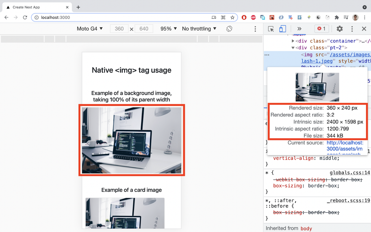
Even though the rendered size on a mobile view is 360 x 240px, the intrinsic size, which is the size of the image received from the server in the browser, is 2400 x 1598, and that is the image original size. The file size is 344kB. Not very efficient.
It’s not efficient because a big and heavy image was requested, and then it was displayed in a small size.
Card image example
Let’s now see a card image example, also using the native <img> tag.
The JSX code of the card is:
//Example of a card image with <img>

<div className="card" style={{width: "18rem"}}>
  <img src="/assets/images/unsplash-1.jpeg" class="card-img-top" alt="..." />
  <div className="card-body">
    <h5 className="card-title">Card title</h5>
    <p className="card-text">Some quick example text to build on the card title and make up the bulk of the card's content.</p>
    <a href="#" class="btn btn-primary">Go somewhere</a>
  </div>
</div>index.js
If we inspect it on Chrome Dev tools, we see the following:
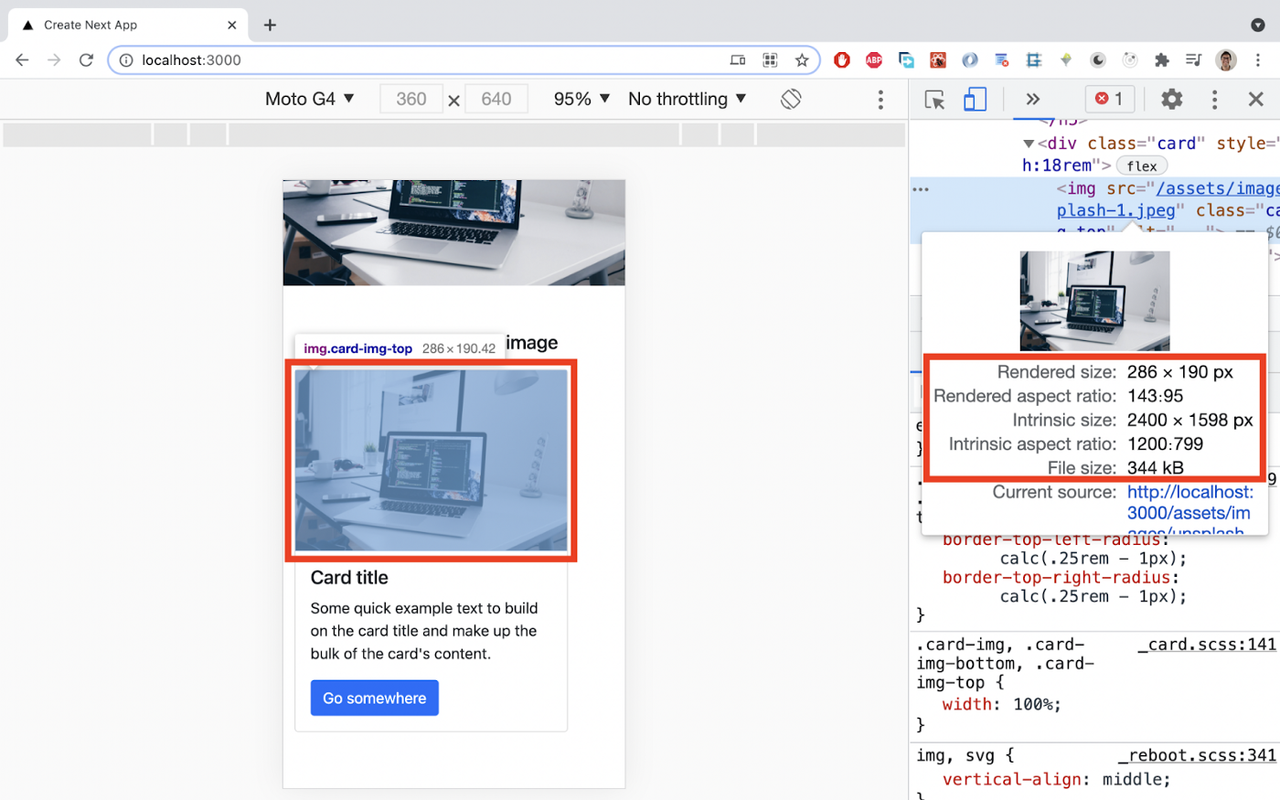
We see the same issue here: a big and heavy image was requested and displayed in a small size.
Let’s look at the Network tab on Chrome Dev tools to check the requested image format:
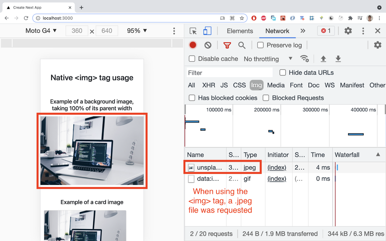
So, as we can see, the image format requested was jpeg. It would be nice to serve a more modern image format like WebP and lazy load it, so the image is only requested when it is about to enter the viewport.
Trying to solve image issues without Next.js
What if we try to solve the issues mentioned above without the help of Next.js?
- For resizing: we could write some code to detect the screen width and then request the appropriate image size, provided we have different sizes of images stored in a CMS, for example. But that would mean a lot of coding.
- For modern image formats: we could generate WebP versions of our images and store them somewhere. Then, we would need to write some code to conditionally serve first a WebP image if the browser supports it but serve another format otherwise.
- For lazy loading: we could make use of a library, like “react-lazyload” (https://www.npmjs.com/package/react-lazyload)
But it seems we’re getting tired of just thinking about all the hassle of solving all these issues. It feels like:

How to use Next.js <Image> component
Here is some good news!!
Next.js has already done all the heavy lifting for us since version 10.0.0 and gives us access to image optimization functionality through a component with a tag of <Image> with a simple API! 🚀

Summary of benefits when using <Image>:
- Resizing: shipping the right file size for each screen size
- Optimization for external sources: works with any image source. Even if the image is hosted by an external data source, like a CMS, it can still be optimized!
- Low build times: as image optimization is done on-demand, there’s no need to create multiple images with different sizes and formats. Hence, the build time is not affected.
- Images are lazy-loaded by default. That means your page speed isn’t penalized for images outside the viewport. Images load as they are scrolled into the viewport.
The first step to use it is to import it from the Next.js library:
import Image from 'next/image'
index.js
And then it’s a matter of using it in your JSX code, passing it at least an src property:
<Image src={path to your image} />
index.js
If you want to use images stored inside your Next.js project, an easy way is to put them inside the /public folder. Otherwise, you get an error.
Other properties must be passed to <Image>, but this depends on the behavior we want the image to have.
We’re gonna see how to replace <img> with <Image> for the background and the card image examples already shared above.
Background image
Let’s see how we can use <Image> to render an image as a background.
This is the JSX code:
//Example of background image using <Image> component

<div className="pt-2" style={{  position: 'relative', width: '100vw', height: '66.66vw'}}>
  <Image
  src="/assets/images/unsplash-1.jpeg"
  layout="fill"
  objectFit="cover"
  />
</div>index.js
Besides passing the required src attribute, the layout and objectFit properties were passed. The fill and cover values result in a <img> with this CSS property being applied to it: object-fit: cover; To learn more about this CSS property, read this documentation: https://developer.mozilla.org/en-US/docs/Web/CSS/object-fit.
If we inspect it on Chrome Dev Tools:
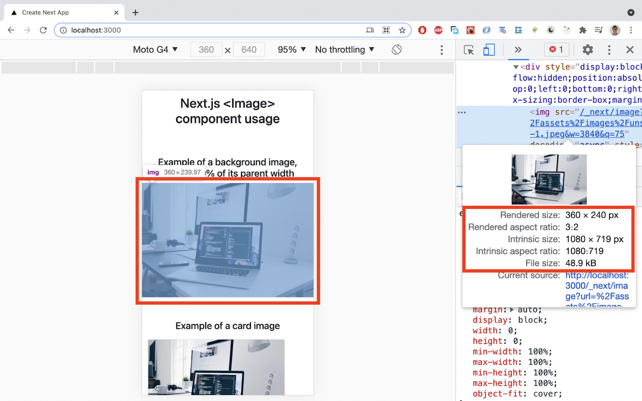
Amazing!! Now, the background image intrinsic size is 1080 x 719px, instead of 2400 x 1598px when using <img>. And look at the file size: 48.9 kB, instead of the 344 kB when using <img>.
Let’s now look at the Network tab on Chrome Dev tools to see the format of the requested image when using <Image>:
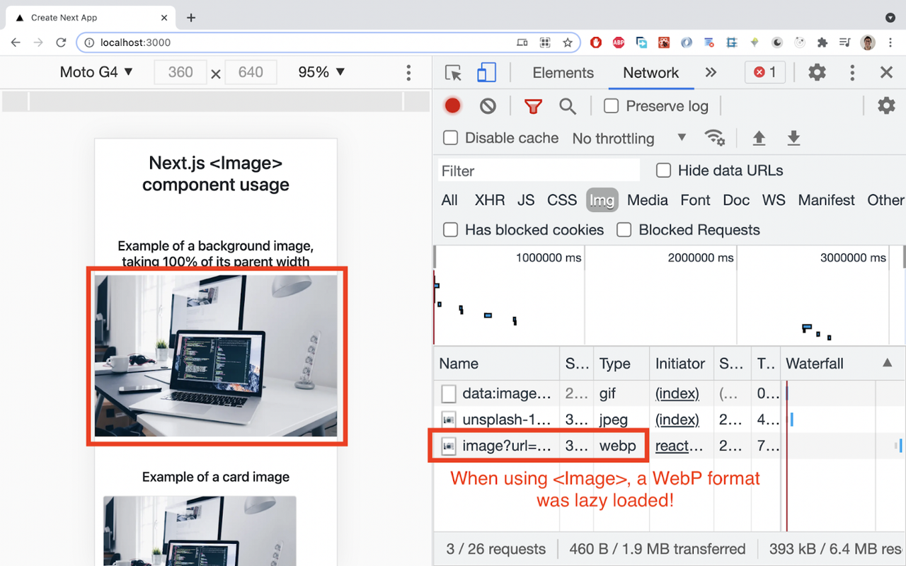
Yes! A WebP format was requested when scrolling to the app when <Image> was used. It’s mind-blowing getting all these functionalities out of the box!
What HTML tags does the <Image> component have?
Depending on the properties passed to the component, there are 1 or 2 wrapping divs for the <img> tag, like this:
<div>
  <img />
</div>

//Or

<div>
  <div>
    <img />
  </div>
</div> index.js
Card image
Now is the time to render a card image using <Image>.
This is the JSX code:
//Example of card image using <Image /> component

<div className="card" style={{width: "18rem"}}>
  <Image
  src="/assets/images/unsplash-1.jpeg"
  // just put the original width and height of the original image, in order to provide the right aspect ratio
  // Next.js will automatically reduce the size if the rendered image needs to be smaller.
  width={2400}
  height={1598}
  layout="responsive"
  className="card-img-top" alt="..." />
  <div className="card-body">
    <h5 className="card-title">Card title</h5>
    <p className="card-text">Some quick example text to build on the card title and make up the bulk of the card's content.</p>
    <a href="#" className="btn btn-primary">Go somewhere</a>
  </div>
 </div>index.js
Besides passing the required property src, width, height, and layout properties are also passed.
The width and height of the image are passed in pixels. They must be an integer without a unit.
It can be not very pleasant to pass these two properties, but that’s data Next.js needs to do its magic.
In this example, the original width and height were passed (2400 x 1598px) because the image will be scaled down for small viewports. That is what layout=”responsive” does for us. If there are super big viewports, Next.js also scales the image up as well.
If we inspect it on Chrome Dev Tools:
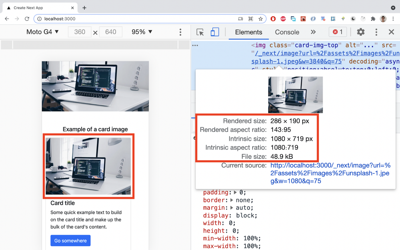
As we can see, the rendered size is 286 x 190px, the intrinsic size is 1080 x 719px, and the file size is 48.9 kB. If we also inspect the Network tab, we see that the requested format was WebP, so we’re getting the benefits of the <Image> component!
Conclusion
After seeing these 2 examples of the <Image> usage and inspecting them on Chrome Dev tools, you can see how easy is the API and the huge benefits of using it:
- Modern WebP format when is supported by the browser
- Smaller image sizes for mobile views
- Smaller file sizes
- Lazy loading
- No need to create multiple image version with variations on file format and size
- Optimization even for images stored on a CMS
So, the next time you need to add images to your Next.js project, remember: Next.js has already done a complex code but easy to use through their API.
We’ve seen in this article just the basics of using the <Image> component, so for more advanced things or other use cases, please go to https://nextjs.org/docs/api-reference/next/image and find the answers there.
You’ll save tons of time and focus on other aspects of your app that need your attention.
To check the full course covering Image and other features visit:
https://academy.eincode.com/courses/complete-next-js-with-react-node-beautiful-portfolio-app
💻Happy coding!💻
Esteban Munch Jones
Senior developer and educator passionate about making programming accessible to everyone through practical, hands-on learning experiences. Creator of 100+ courses with over 100,000 students worldwide.
Enjoyed this article?
Subscribe to our newsletter to get the latest programming tutorials and insights delivered directly to your inbox